Saturday, 23 November 2013

Reading Week 2 (Current research overview)

I have been looking at a broad range of research over this semester, which has been both interesting and insightful. I have further explored information design, focusing specifically on wayfinding. I have looked at wayfinding found in different types of buildings, such as hospitals, zoos, museums and even car parks. I have reflected on what makes a wayfinding system legible and how they work successfully to explain how you can get from one destination to a other.

I have also looked at wayfinding that is used outside, such as on trails (for bikers, hikers and children) and various outdoor information boards. I plan to focus my project around wayfinding for an outdoor trail, so found this very insightful. Typical trail markers tend to be wooden poles, marked with tips of bright colours, and information boards displaying easy-to-read maps.

As well as adult wayfinding, I have also looked at children's wayfinding and have discovered that children need something that holds their attention. Bright colour and characters are a common method used, I have noticed, as well as introducing interactive elements, such as the stamp machine that is present in the London Transport museum.

I think I will now focus my research down to discover more about children's wayfinding systems and what needs to be done to make them successful.

Saturday, 16 November 2013

Weast Seattle Trails: Materials

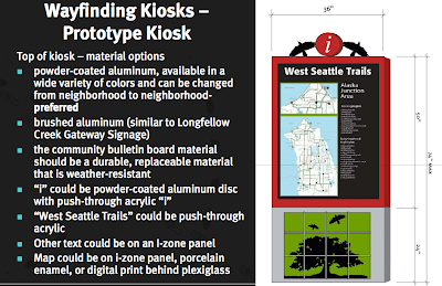
West Seattle commissioned a wayfinding system to get people more involved in West Seattle walking trails. The designs I looked at were finalised in 2011.

Design concepts:

They proposed designs are immediately identifiable as a wayfinding system. The letter 'i' is often used to mark such a system and people could look out for this part of the design from a distance away. The bright red the circle the 'i' is displayed in will also catch a hiker's attention, while I also think the circle will stand out because it is separated from the rest of the design. The circular shape has been cut out, therefore it will not be lost on a flat background.

An added element was also put into these designs; the artwork that will hang below the map and important information. This gives a further aesthetically pleasing appearance to the sign, while it could also attract the attention of children. The images displayed in the artwork are of nature, trees, animals, waves etc, which keeps in mind the trail the wayfinding system is representing. I think that these image also encourage the hiker to continue on this trail, for perhaps then they will think they are  able to see similar sights, view similar animals, for example.

They also took careful consideration when it came to the type of materials that they could use: 

I found it very helpful to be able to look at the materials that they had considered for their signs, for not a lot of information can ever be found regarding what materials are being used for different wayfinding systems. It says that they prefered to use powder-coated aluminum for the top of their sign, which would display the map and various other information. This was because this metal could be available in a wide range of colours, which could be changed depending on which neighbourhood the signs were displayed in. They also considered that their signs had to be durable and weather-resistant, for they were being displayed outside, which means that the environment the signs are placed in could be unpredictable.

Final designs:
The designers ended up incorporating a wave effect at the top and bottom of the sign, which relates to its surrounding environment. The bright red of the image stands out amongst the grey and light blues of the map, yet I have to wonder if that is enough to make the sign, as a whole, stand out from a distance.
The images of the final artwork (seen at the bottom of the sign) will appeal futher to children, as it adds a textured piece of art for them to take interest in. However, I don't think that it would be able to hold their attention for long. Perhaps something more interactive could accomplish this.


References:
http://westseattleblog.com/2011/04/finding-your-way-through-fauntleroy-kiosk-now-in-place/

Axel Peemoeller - Car Park & Ralston & Bau - Underground-Inspired Wayfinding


Axel Peemoeller
Designer Axel Peemoeller developed a unique and creative wayfinding system for the Eureka Car Park in Melbourne.
As you make your way through the car park's interior, you are given directions. Long lines of vibrant colours are painted on the walls and floor and when you stand in the correct location you are able to see that they make up a word. Peemoeller makes use of primary colours, for “Down” is shown in a vibrant yellow colour, “Out” in red, “Up” in blue and “In” in green. However, someone pointed out on this blog that it could be questionable whether yellow was a sensible colour choice, saying that if you were to look at the yellow paint in a location where you cannot see how it forms the word “Down” you may mistake the paint for double yellow lines, signalling caution to drive in that direction.
This wayfinding system is so unexpected and creative. I can imagine these signs to be intriguing and fun to view. The large, bold words clearly mark the way in which you should be driving, meaning that it also works successfully as a wayfinding system. Yet there is also an added playfulness.
---

Ralston & Bau 
Ralston & Bau is a design studio that designed interesting wayfinding for the Storehagen Atrium building in Norway in 2011. The Storehagen Atrium is a 5000 m2 governmental building. The wayfinding system they designed for this building was heavily inspired by the underground signage. Strong colours and graphical shapes are dedicated to each floor and insinuation. They wanted their signs to be universal, to make the system easy to understand for any user, such as people with visual impairment.
Colours begin in one place, explained at the start with adjoining text and numbers to show which section of the building they represent. Users can then follow their colours to their end destination. This a wayfinding technique that I have seen in buildings, such as the Worcester City Centre Campus and by local doctors. I have always found that they work very successfully.


References:

Mike & Maaike: Wallpaper Wayfinding

Mike & Maaike is a industrial design studio led by Mike Simonian and Maaike Evers. Together they designed a series of wallpapers that worked as a wayfinding system.
Wallpaper is typically decorative, while symbols/pictograms are typically functional... by combining the two you are given a working wayfinding system that is also very aesthetically pleasing and easily compliments the surrounding space.
I think that the wallpaper may stand out more prominently than regular signs, for it is taking up much more space. You would be able to see the wallpaper symbols from a great distance, perhaps even if you have poor eyesight, and therefore you would be able to find your destination with more speed.
The symbols that appear on the wallpaper are traditional, universal pictograms that clearly represent what they are explaining. For example, the typical male and female symbol has been put in use to show the direction of the toilets, while arrows have been used to show the way to the exit and a knife and fork leads the way to a cafe. Typical colour has also been used, with a bright pink to show where the female toilets are located and green arrows to show the direction of fire exits. Most of these colours are also very vibrant, so that they can be easily spotted.
The wallpaper does not exactly point you in the direction of your needed destination (apart from the arrow wallpaper that shows exits), though it seems to mark the end destination. The wallpaper seems to be set up to lead you to the area. For example, at the end of corridor you are able to see the male and female symbols for the toilet. By walking toward the wallpaper, you are then able to look around the corner, where you can see different wallpaper, showing the pink female symbol for the women's toilet or the blue male symbol. These symbols are shown just outside of the toilet doors.
Perhaps signs would need to be put in place at the entrance of the building, to lead people in the right direction of different locations and then, once you are drawing closer to that destination, the wallpaper wayfinding system can be put in use.

What is also great about this design is that it could be understood by both adults and children. However, more advanced symbols may be confusing to children.


References: 
http://www.mikeandmaaike.com
http://www.mikeandmaaike.com/#p_wayfinder-wallpaper
http://www.mikeandmaaike.com/press/WAYFINDER%20WALLPAPER
http://ccd-design.blogspot.co.uk/2010/11/wayfinding-is-more-than-signage-using.html

Saturday, 9 November 2013

Robert Kent Wilson: MTB Wayfinding (Bikes)

Robert Kent Wilson was commissioned to develop an identity and wayfinding system along the Metripolitan Brand Trial (MTB). This is an 8-mile trail, running from Union Station in the District of Columbia to Silver Spring in Maryland. It is an important transportation route that provides connections to homes, work and play, meaning that a lot of people travel using this route every day.


RKW created a an identity that includes: logos, signage, wayfinding and public art. The wayfinding elements help public identify the trail. The trial is also broken down into segments, with zones being established to identify communities along the way. Different neighbourhoods are identified using specific icons, while web-enabled wayfinding was also explored in order to assist users remotely from the trail. This is shown on their website:

Seen on a phone, the path has been cut down to the most minimalistic display of information. This allows someone, quickly glancing at their phone, to be able to understand the information at a faster rate. Seen below:
The logo is simplistic, yet effective. The is immediately alerted to the logo for MBT and the same use of typeface. The colours used are contrasting - red, white, green - which means that together they offer a 'splash' that it to be taken notice of. An arrow has also been incorporated into the design to point the biker in the right direction.

Using wood as a material to form the post is also a very common method used in trails, especially woodland trails. In my opinion, it mixes the old and the new, giving the sign post an aesthetically pleasing appearance. As seen below, the wood is also usually tipped with colour (here it is red) at the top. This is a common method used in wayfinding and it alerts the viewer to a sign or trail. Sometimes, different trails can be marked with different colours, which lets you know if you are following the correct path and trail or not.
Designing for someone who is riding a bike is also an important consideration that Robert Kent Wilson would have to think about, as bikes move at a much faster pace than hikers. It was probably therefore important to keep the sign simplistic, with limited information, so that it can be read with one quick glance when someone is traveling past it with a higher speed than a walker. The sign above alerts the biker of a wayfinding sign with the strong logo and vivid colour. It also points them in the right direction, which is all it needs.


Ending Thoughts:
- The logo has been displayed throughout the designs, creating a strong brand.
- I found it interesting that wayfinding via the internet had been taken into consideration. This also included the use of smart phones, where unneeded information was cut to make the route easy to understand.
- The constrasting colours of red, green and white are vivid and work well. It means that the signs will stand out and bikers will be alerted of the wayfinding system from a distance.


References: 
http://www.robertkentwilson.com/public-art/index.html

Time Management: Altered Schedule

I have decided to make Saturday the day to focus on my Negotiated Production module. This is because I felt constantly unmotivated on Fridays and ended up mainly working on Saturdays anyway. By reinforcing this new timetable, I feel like I will be able to get much more work done.

PIXO Design: Greenbelt Trails Wayfinding


PIXO Design is a creative studio in Ottawa, Canada. They were commissioned to design a wayfinding system for "a complex network of over 150 kilometres of trails that crisscross the National Capital Greenbelt." This was an area of about 200 square kilometres, made up of forests, farms and wetlands surrounding Ottawa. They decided to mark the trails in waypoints (a waypoint is a reference point, set up in a physical space, which is used for navigational purposes), meaning that users could string the waypoints together to create their own itinerary. PIXO said of this, "Since a waypoint’s identity is specific to a location, it also improves safety and security by allowing a more accurate means of locating people in case of emergency."


Their fingerposts hold a small map that shows all waypoints. This makes sure that hikers know where they are and how far other waypoints are from their current destination. The fingerposts also hold information regarding how to back to packing lots.


Colour has been used to give the wayfinding signs a clear appearance. The combination of green and brown will alert hikers immediately of the wayfinding system. However, I'm not sure that these signs would stand out from a distance. It seems to me that their use of green and brown will make the signs blend completely into their surroundings of trees and foliage. Perhaps more vivid and contrasting colours would be better suited here.

The positioning of the map and other information has been cleverly done. The map is slightly lower than your average eyeline, meaning that children and people in wheelchairs will be able to clearly read the map. I have noticed that when confronted with a map, people usually point at it, using their finger as a grounding point so that they can understand the map more clearly. This can also be seen in the above photograph! The map is therefore at a perfect height for everyone to do this.

The following information, which signals directions to important places (such as parking), is then resting at a higher point on the sign. This means that people are alerted of a wayfinding system from a distance and do not need to get too close to the fingerpost to see what direction they are looking for.

I think that these designs are clear enough for a child to understand them, yet they would not be able to capture a children's attention, for they are really laid of for adults to read. 


References:
http://pixodesigncanada.wordpress.com/portfolio/orientation/greenbelt-trails-wayfinding/
http://pixodesigncanada.wordpress.com/

Wayfinding From Around The World

I discovered the website, http://www.smashingmagazine.com and was intrigued by their section "Street and Wayfinding Signs". They presented wayfinding signs sent in to the World of Signage Photo Contest. These photos have been taken from around the globe, something which interested me greatly. I wanted to find out if there were similarities between the wayfinding systems from so many different countries or witness unusual approaches I had never seen - or thought of - before.

Vermont
The information alongside this photograph (from Ahmet Zehir from the USA) reads, "I headed to Vermont for a weekend with bunch of friends couple of weeks ago. These arrows were on a tree that we stumbled upon while we were trailing. I loved the juxtaposition of the vastness of the forest and the vague directions that these arrows were pointing."

I took particular interest in this photo for it was wayfinding for a woodland trail, something that I may be focusing my project on in the future. The simplicity of this sign is obvious: an arrow on diamond-shaped sign, nothing more. Though thought has been placed into colour: the orange/yellow stands out amidst the surrounding browns and greens. 


 Manufaktura, Poland
This photograph was taken by Wojciech Jachowicz, from Poland, of guideposts in a shopping centre's square. This example of wayfinding immediately caught my attention as I was scrolling down the page, simply because it looks so unique and unusual to me. In England, I don't think I have seen a similar sign, were it is just one block of colour, the design not differencing in width throughout. They are very attractive signs, however, with their warm colouring and subtle blends of patterns. I think that they would be easy to understand too, for they display clear text and the adjoining arrows make sure you know which direction to head in.


The Netherlands
Well, this is certainly one way to do things. The wayfinding instructions have been written on rocks. The information is clear, certainly, pointing you in the right direction with the use of pictograms. However, it is only useful if you are able to spot these rocks! Some people may walk right past them; we are trained to spot wayfinding systems from their clear appearance, their use of contrasting colours and their bold, attention-grabbing image. Obviously, if you started using rocks to convey wayfinding information, people will get lost much more oftern, yet this photograph is still fun to view.

The photo was taken by Pim van den Berg who says, "This sign is placed along a hiking route. I can imagine the residents of the farm to the right (prive means private in dutch) got a bit annoyed of having people wander about their house all the time. Their solution is very elegant design-wise in my opinion."

Dubai 
This photograph was taken outside Jumeirah Beach Residence (JBR) by Anas Marwan. They explain, "In JBR each block of buildings signage has a unique signage design, and each design consists of two elements: colour and symbol. Were violet represents Seashells (Sadaf in arabic), red represents Coral (Murjan), Blue for Sea (Bahar) and Orange for Sands (Rimal)."

This is an interesting technique to put in place and the warm, exotic colours themselves are reminiscent of the Dubai culture. The sign is large and bold, with little information present, perhaps so that the signage is not cluttered with text and therefore more troublesome to read. The large arrows point the viewer in the correct direction.

Iran
This photo was taken from a sign in Sa'dabad Palace, in north of Terhran, taken by Arash Haji Vaziri. The Sa'dabad Palace is currently the official residence of the President of Iran, while parts of the Palace compound are museums, in which visitors can roam through and look at the rich history of the country.

The intricate cut-outs of the sign showed to me immediately that the area was rich and important. The delicate pattern of the sign alerted me that this was a classy area. Perhaps this is because a certain effort has gone into the wayfinding design, to make it appear unique, while extra money has been splashed cutting out the pattern from the metal. I think the mossy-green colour of the sign may take away from this somewhat, however, and it is unlikely to stand out, especially since green foliage seems to be its surroundings. The typeface used is simplistic, a serif font, which is more unusual to be seen on wayfinding signs, which prefer sans-serif.


Bangladesh

The website says of this photograph, "Mountain Distance Indicator in Bandarban, Bangladesh. Created by Md. Akhlas Uddin." As I scrolled through pages of different wayfinding, I was surprised to see a number of signs, such as this one, had a handmade touch. The text for this sign seems to have been painted on using white paint, giving it a rough appearance. To me, the sign does not appear very professional, yet it also holds a certain charm. I wish I knew more about it, for I would like to know if a sencil was used, as, with the English lettering, there seems to be a clear typeface being put into use.


Austria
This sign points to a boat rental service in Hallstatt, Austria and the photo was taken by Dieter Veverka. This is certainly a creative approach to a sign, for it has been turned into a sailor. His hand points the viewer in the correct the direction, his pointing finger replacing the well-used arrow typical to wayfinding signage. Though the text is in a different language for me, I would be able to understand this sign regardless. The theme of the sign is clear: this man is a sailor. The colours, the anchor on his arm and even his hat tells me this. However, there is something about his hollow eyes and gaping mouth that scares me a little bit...


California
This photo was taken of the California Science Center by Enrico Santana. A colour system seems to be in place here, which is very interesting to see. I would like to know which colours represent what, however. A colour system is successful when there are many points to the sign, such as in the photograph above. If you know what colour to look for, you can narrow in on those signs, rather than having to look through all the signs to find the one you want. I think that this photograph demonstrates the type of wayfinding signs I am most used to seeing in England: the traditional pointed rectangular shape and a well-used sans-serif typeface. It is elegant, professional, while the colouring gives it a more light-hearted appearance. 


Egypt
This photograph, taken by Kristina Ivandic, shows the signage for the Valley of the Kings in Egypt. The rusted appearance and sun-kissed colouring of the sign looks to be at home in a hot, dry place. As soon as I looked at the sign, in fact, I thought that it was signage designed for a desert, or somewhere just as hot. I was also interested to see stencils being put in use for the typeface. The black colouring of the letters, as well as the black border, makes the sign stand out. It could have been overlooked due to its camouflaged background colour, so this was a smart move that makes the sign appear more striking. This wayfinding sign is simple and bold, making it easy to read and discover.


New York 
The photo was taken by Tracey L. Warner and shows a directional sign located in Battery Park, New York, USA. The tyepface put into use is actually reminiscent of one used throughout my university. Perhaps this is what drew me to this sign. It is an unusual choice of typeface to be used for a wayfinding sign, as it is a serif font and too much of it could also appear a little cluttered. However, it is easy to read and stands out here. I found it interesting that the more important information ("Statue of Liberty", "Ellis Island") was presented in a much larger typeface. Perhaps these are the locations that most people are looking for and so the large typeface alerts them more quickly to this destination. Pictograms have also been put into use here, showing clearly where food and drink and the toilets are located. Now that I look back on the other signs from different countries, I see that few of them have used pictograms, which has actually surprised me.


Ending Thoughts
It was interesting to see different examples of how countries approach wayfinding systems. I think that I was blinkered when it came to this, as I was so used to seeing English Wayfinding signage. This research was therefore an eyeopener.
- It was also good to consider how signs can be made to be understood for those who cannot read the language present on the sign. Pictograms can be enforced, or the sign could be given the appearance of the destination it is pointing to.
- Every sign that I looked at incorporated an arrow into their design, pointing to the destination it described. This makes it a lot easier for everyone to understand where they should be heading.
-Most of these signs are also designed for adults and may be unclear to children, perhaps with the exception of the Austria one.


References:
Saturday, 2 November 2013

Hoveton Hall Gardens: Children's Trail

Hoveton Hall Gardens went through a rebrand, starting in 2007, by working with the company TEN Creative. Perhaps the design is outdated now, but I still felt that it linked well to my Negotiated Project. I was more interested in the redesign created for the children's trails in 2011.

The first trail was aimed at children between the ages of 2-6. The idea of this trail was to collect all six animal stamps, which are located around the gardens, to win a prize. This is quite a similar technique to what was done in the London Transport Museum (see a previous post) and encourages the children to “collect them all”, therefore keeping their interest for a longer period of time. A prize also offers a further incentive. 
The second trail was for the ages of 5+ and involved a friendly dragonfly mascot, Harry Hover. The dragonfly guides children through interactive challenges and activities. TEN Creative said that the dragonfly, “Was an instant success! And feedback from the visitor cards echoed this resoundingly.” Introduction of a character, such as “Harry Hover” is always a strong technique that manages to get children involved. 
 

They also created colour quiz sheets, with an illustrated trail map to lead the way, colouring sheets and puzzle sheets. A lot to keep children entertained. 


I felt that the designs above were rather outdated and could be improved. Though they are very busy, which will grab the attention of children and the character does appeal to a younger audience. Perhaps the leaflet itself could have been even more interactive, offering more than just a flat surface of information. 

References:  
http://www.hovetonhallgardens.co.uk/index.asp?pid=7