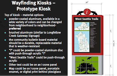
Design concepts:
They proposed designs are immediately identifiable as a wayfinding system. The letter 'i' is often used to mark such a system and people could look out for this part of the design from a distance away. The bright red the circle the 'i' is displayed in will also catch a hiker's attention, while I also think the circle will stand out because it is separated from the rest of the design. The circular shape has been cut out, therefore it will not be lost on a flat background.
An added element was also put into these designs; the artwork that will hang below the map and important information. This gives a further aesthetically pleasing appearance to the sign, while it could also attract the attention of children. The images displayed in the artwork are of nature, trees, animals, waves etc, which keeps in mind the trail the wayfinding system is representing. I think that these image also encourage the hiker to continue on this trail, for perhaps then they will think they are able to see similar sights, view similar animals, for example.
They also took careful consideration when it came to the type of materials that they could use:
I found it very helpful to be able to look at the materials that they had considered for their signs, for not a lot of information can ever be found regarding what materials are being used for different wayfinding systems. It says that they prefered to use powder-coated aluminum for the top of their sign, which would display the map and various other information. This was because this metal could be available in a wide range of colours, which could be changed depending on which neighbourhood the signs were displayed in. They also considered that their signs had to be durable and weather-resistant, for they were being displayed outside, which means that the environment the signs are placed in could be unpredictable.
Final designs:
The designers ended up incorporating a wave effect at the top and bottom of the sign, which relates to its surrounding environment. The bright red of the image stands out amongst the grey and light blues of the map, yet I have to wonder if that is enough to make the sign, as a whole, stand out from a distance.The images of the final artwork (seen at the bottom of the sign) will appeal futher to children, as it adds a textured piece of art for them to take interest in. However, I don't think that it would be able to hold their attention for long. Perhaps something more interactive could accomplish this.
References:
http://westseattleblog.com/2011/04/finding-your-way-through-fauntleroy-kiosk-now-in-place/


No comments:
Post a Comment