Showing posts with label research. Show all posts

Friday, 9 May 2014

USER TESTING

I felt that User Testing was vital to my work. I therefore enlisted the help of school children (aged 5-7, my target audience). They were asked to answer questions and critique my work.

Here are the sheets they filled out:


ALL of the children responded that they like to go on walks! Having researched about the number of children glued to screens this was very refreshing to hear. The response on how often they go out with their friends and family was mixed. Some responded that they go out a lot, others said not so much. A lot of children said they went to the park.
The children liked the characters a lot. However, I did not that no one picked the moon as their favourite.


I next wanted to see if the kids could do the pumpkin activity sheet. The results are below. They had fun drawing the faces. They would have liked the reward of a sweet for the task's completion after the trail.


Written by the teacher after asking the children numerous questions about my work. Saying what the children were asking and talking about:

Can we do the walk? 
That looks exciting.
I like the witches.
I love Halloween. (...Basically a Halloween trail is a brilliant idea as it immediately excites the kids and they want to go.)
I love the activity sheet. I would love to do this. The faces are funny...cute...exciting.
Would like treats rewarded when finished Pumpkin activity sheet.
They liked all the characters.
They were extremely excited by the activities and wanted to do them there and then! 
They found it fun to even copy the faces! 
I love the pumpkins. Can we make one? Do you make one on the trail?
My dad would like to do these activities too.
Liam said...Are there no ghosts? I love ghosts they are spooky. 
Later... Will there be ghosts on the walk?.....later could we dress up as ghosts.....later where are the ghosts? 
He went on and on about ghosts.

I've obviously made a mistake to not include ghosts! As Liam was pointing out. Since none of the children answered that the moon was their favourite character, instead opting for all of the others, I think it would make sense to replace the moon character with a ghost!

Treats was also something pointed out. A number of the children expressed that they would have liked some sort of reward after the trail. Many suggested treats. I think it would be a great incentive. Perhaps Halloween themed treats could be on offer! This also links back to trick or treating.

 
The children also had a number ideas for me! I asked if they had any ideas for activities you could do in the wood for my witch signs. Their answers were wonderfully creative. Seen below:
I'll be giving them credit for this one!

Overall, I found user testing so important. It has definitely made me consider a few things, but overall I am pleased that the children understood and really seemed to like my design.

Typefaces for children

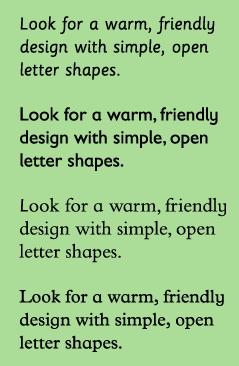
I undertook research to understand which typefaces would be the most suitable for children.

On Kidstype.org noted:

There is no research that says that either serif or sanserif typefaces are intrinsically more legible. Teacher opinion, generally, favours sanserif typefaces because of the simplicity of the letter shapes.

Warm, rounded typefaces were liked by children because of their friendly appearance. Typefaces with larger x-heights are easier for children to read.

Condensed and expanded typefaces make it hard for children to read. So do very bold or very light typefaces.

Sassoon Primary is a font that is specifically designed for young children, as well as Gills Sans Infant, Bembo Infant and Plantin Infant.


In general, it is true to say that some typefaces are less suited for particular uses while others are specially designed for them. Gill Sans, for example, is very popular for children’s books because it is a humanistic lineal. Distinct shapes with sufficient differences between the individual letters that, especially in the larger font sizes used in books for small children, are more similar to teaching material than seriffed types.
And:
A few typefaces used for children’s books and texts for the visually impaired and dyslexic. Gill Sans is often used for children’s books because of its mild character. APHont was specifically designed for the visually impaired. Tahoma and Comic Sans are considered easily accessible alternatives by interest groups for the visually impaired.


I therefore decided to use Gill Sans for my body type.

I used Bebas Neu for headlines. Headlines is where you can get a quirkier font, for children can read them easier, for there is not very many words present. Bebas Neue is bold, dominant and therefore good for headlines.

Other fonts were inspired by the Gothic nature of my woodland trail. 


References:


Wednesday, 7 May 2014

Different Types of Learning

There is recognizably three different types of learning: Kinesthetic learners, visual learns and audible learners. I felt that this was important to identify during my children's trail, to understand how some children might feel happier about engaging with my design.


Kinesthetic Learners
- Also known as tactile learning.
- Learn by carrying out a physical activity rather than listening or watching.
- Make up about 5% of the population.
- It helps them to move around when learning.
- Good hand-eye coordination.
- Often restless, fidgeting etc. 
- May be good at repairing work, sculpting, art or working with various tools.
- Interactive design may appeal to them.

Auditory Learners
- A person who learns through listening.
- Learn through hearing and speaking.
- Can hear changes in tones, rhythm.
- Can work better with noise in the background e.g. music or TV. This helps them concentrate more.
- Often good at storytelling.
- May talk to themselves or move their lips and read out loud.

Visual Learners
- Learn through written language, such as reading and writing tasks.
- Prefer using images, pictures, colours and maps to organise information. Likes visual support.
- Learn best through seeing.
- Usually take not for lectures.


Kinesthetic learners might therefore be happier to interact with my design, to play and feel and lift flaps. A level of interactivity will certainly appeal to them. Visual learners, on the other hand, may enjoy activity sheets and processing and reading images and text on information boards. While audible learners may find it helpful to have someone else - perhaps an adult - read them the information. They could also enjoy activities that involve sound - such as listening to the calls of birds, for example, while they could also enjoy storytelling and narratives.


References:
http://www.nwlink.com/~donclark/hrd/styles/vakt.html

Where The Wild Things Play

Wildplay is based at Herefordshire Nature Trust and encourages children to explore the outdoors. One way they do this is through their WildPlay Area, which offers environmental play activities for children.

They have also produced an activity pack, which encourages children to interact with the outdoor world.
The symbols on this page make it easy to identify what type of location a certain area is or which season the activities are best performed in. The symbols are easily understood, obviously represent what they do with clear imagery.
The layout of the activity sheets is very playful, almost messy. Text winds it way across the page, with imagery to stop it becoming overwhelming. Only green has been used but I feel like the pages could stand out more if they had other brighter colours too.

Explaining nature activities.
 Other activities. Creative ways of making nature fun for children.
Again, these activities make the most of nature. Den building, cloud gazing... there is a lot that can be done outside.
Encouraging skills such a tracking.
I love this idea - of having children tick things off as they find them. This encourages them to be on the alert all the way through the trail without them getting bored. The 3D design of the pages also add an extra fun level of interactivity.
Educating about different types of leaves. Clear illustrations.
Educating about different fruits and seeds.

Overall this activity sheets really make the most of nature. Not only do they educate children about things they probably didn't know about, but they also create fun ways to engage children in nature.


References:
http://wildplay.org/

National Trust Easter Egg Trail


The National Trust hosted an "Easter Egg Trail". I felt that this linked to my work greatly, for they also produced a children's trail for a festivity, this being Easter instead of Halloween, which is my focus. The trail encouraged children to get out of the house, enticed by fun trails and activities.

Written on their website:
Every trail will start at Base Camp where they will receive their Eggsplorer Kit featuring;
A Pith Hat – A ‘make it yourself’ Eggsplorer hat, to make sure your little adventurer looks the part.
Trail Journal – Containing their eggspedition trail map and clues so they stay on track.
Trail Passport – An essential log to record stamps collected along the trail and at other trails you attend.
After successfully completing the trail each Eggsplorer will be rewarded with a delicious Cadbury Egghead.
Kids can also enter our ‘Design Your Own Egghead’ competition, where one lucky winner’s design will be made into a real Cadbury Eggheads in 2015.

As you can see from the above description, there is a lot happening with this trail.  Creativity is certainly being encouraged with a lot of opportunities for children to make things.

The colours used to represent this trail are bright and colourful. The purple is so reconginsable as Cadbury, the sponsor. Vivid green and blues compliment this hue and make the designs appear bright, alive and exciting.
Two "mascots" feature across the design - a chick and a rabbit, obviously referencing Easter. They are humanized through clothing, while they are given items that link them back to the trail: binoculars and maps.

Activity sheets are also available. These are quick, fun activities for children to do if they grow bored. Many are Easter themed.
More can be found here: https://www.eastereggtrail.com/Assets/Media/Cadbury_EasterEggTrail_Trail_Pack.pdf

This trail seems to focus more on printable activity sheets than directional signs or information boards. Teamwork and creativity is encouraged.

I have learned from looking at this example to make the most of the theme (this being Easter in this example) and run with it, finding ways to link your design back to the theme.


References:
https://www.eastereggtrail.com/

Saturday, 15 February 2014

The National Trust

http://blogs.telegraph.co.uk/news/files/2012/08/national_trust.gif 

The National Trust is a large organisation that has created numerous trails around the country.

On their website, they say:

Wayfinding signs play a vital part in making every visit as enjoyable as possible. With good signs, people can find their way around with the minimum of fuss, and feel happily at home. Without them, visitors feel disorientated, frustrated or unwelcome.

They sum up:

Signs at National Trust places should be:
Inviting, welcoming, guiding visitors — never bossy or negative.
Unobtrusive — the fewest signs needed to do the job.


They go on to say that signs should only be placed in a needed location. They do not need lots of signs cluttering the area, when one would have sufficed. You have to think: Is this sign necessary? Will this aid someone who otherwise might have been confused without this signs presence? Or it just an extra frilling? Information design, especially wayfinding, is functional. Signs should only be there if they are helpful and communicative.

The National Trust also have a section dedicated how to design wayfinding signs, which was incredibly helpful for my research.

Make signs unobtrusive but legible
They explain that signs should be as small as possible, so not to be in the way. This, however, might mean that they overlooked. A good balance is obviously necessary. The National Trust also says to create posts and signs from natural material when possible. After undergoing a Green Design module, I agree with this wholeheartedly that it is important to be sustainable when you are given the option. No matter how small, this leads to a better future.
They also press to keep a consistent branding throughout the signs: a dark green and the National Trust Bold typeface should appear.


Don’t overbrand
This was an interesting thought, which I hadn't considered before. And yet it is sensible. The National Trust say: "Signs at main points of entry and visitor centres should show the Trust logo (oak leaf and logotype). But beyond that point, it’s best not to over brand.” They press, however, that every sign should use the National Trust Bold typeface, while most should also include the logo. This will make the signs identifiable to this brand without pushing it onto the viewer.

Recognise partner organisations
They mention that when other organisations are involved on your property, this must be taken into account, perhaps by displaying their logo next to yours.

Look informal
They write: "Write in sentence case, not capitals. Make the text left-justified, not centred. No extra letterspacing (kerning)." This will make their signs look inviting while giving their brand a friendly impression.

Use symbols sensibly
They write: "When it helps, use symbols for things like toilets, disabled access or car park. In most cases, the symbol says enough on its own: in a few cases, you may need to add text alongside it. Use only internationally recognised symbols, and keep them to a minimum."

Writing Signs
They say that language should be informal, positive and simple. They say that information signs should be: "As straightforward as possible. Don’t try to say everything, or the sign becomes confusing. Stick to short phrases, avoiding if you can the need for full stops."

Monday, 10 February 2014

Top Ten Findings


  1. Characters are often involved in successful children's information design, as children can engage more with them than with written text.
  2. Constant markers showing that you are on the right track are important when designing for a trail. Otherwise, people could drift onto the wrong track. It is also exciting for children when they see these signs.
  3. Colour is crucial in wayfinding. Bright, contrasting colours make the signs stand out from a distance, so that hikers don't get lost. Greens and browns would blend in too well with the surroundings of forest, so this should be taken into consideration when designing.
  4. It should also be noted that if colours have been used for another trail or wayfinding signage in the area. These designs should not cross over to avoid confusion.
  5. Interactive elements keep children occupied and stop them from growing bored.
  6. I discovered by researching about Copenhagen's central library that children like obvious, understandable shapes. Simplified maps are also important.
  7. Lance Wyman said of information design: "Don't overlook the obvious. Designers too often neglect exploring ideas because they seem too obvious, trite, corny, etc. when the obvious is transformed into a new image it can be powerful and easily understood." Sometimes obvious works, especially in this area of design, which aim for cohesion.
  8. From viewing Wyman's brainstorming of designs I also realised that idea generation is the key to creating a successful design.
  9. The height of maps and information boards should also be taken into consideration. For example, they have to be at a height where children could still be able to view it clearly.
  10. If using pictograms they should be universally recognisable. This is usually helpful for the people who can't read the text. Arrows can also be used to make the required destination more obvious.

Research Overview

My Negotiated Production study has been focused on information design, more specifically wayfinding design for children. I would like to take my project forward by designing graphics for a children's trail.

During the first semester, I focused on gathering researched. I looked at various areas, such as adult wayfinding, children's wayfinding, wayfinding for buildings and for the outdoors. After undergoing this research, I found definite patterns emerging. Bright colours and the inclusion of characters being some of the recurring imagery for children's wayfinding.

For, at the start of the semester, I looked at wayfinding in children's hospitals. In the Royal Children's Hospital and Great Ormond Street Hospital (see more here) characters were painted across walls to provide a calming, welcome distraction, while they also appeared on directional signs. This was because children are more likely to interact with images rather than words and they therefore notice characters first. Characters were also integrated into outdoor wayfinding for children, such as trails. During research, I noticed that there seemed to be a “main” character, which was used to direct the children around certain areas, while also popping up to explain certain facts. Hoveton Hall Garden's used a dragonfly, Harry Hover, an “instant success”, Bridgend'sHeritage used a colourful owl character, while Whinlatter Forest used a squirrel and took the Stick Man character from a popular children's book. My research shows that children interact well with characters, so this is something that I would consider in the production of my work.

During primary research at Whinlatter forest, the cohesion of information design was realised to be crucial. The Stick Man trail had signs marking its start and finish to avoid confusion. During this trail, there was also constant markers for encouragement and to avoid the hiker from getting lost. The Squirrel Scurry meanwhile did not have this and therefore confusion arose (see more here). The importance of use of colour for signs was also highlighted. A trail should use their own unique colours, making sure that they differentiate from any other surrounding signs to avoid confusion. This was again where the Squirrel Scurry trail became problematic, as it used red, as did an adult trail. If the colour and brand of these signs were unique then they could have also been easily spotted from a distance. Bright colours stand out amongst the green and brown of the surrounding wood, so contrasting primary colours proved to be the most successful. Dark greens and browns could have become lost, blending into their surroundings, and an information board or sign should be easily recognisable.

I found that activities and interactive elements were also important in keeping the attention of young children. The London Transport Museum used stamps, children where given activity sheets for numerous forest trails etc. This helped to keep their attention throughout the day.

Simplified maps were also important so that children would be more likely to understand them, while most designers also used obvious, understandable shapes.

To see more of my research please look through my blog.

Thursday, 9 January 2014

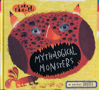
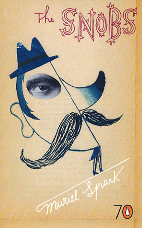
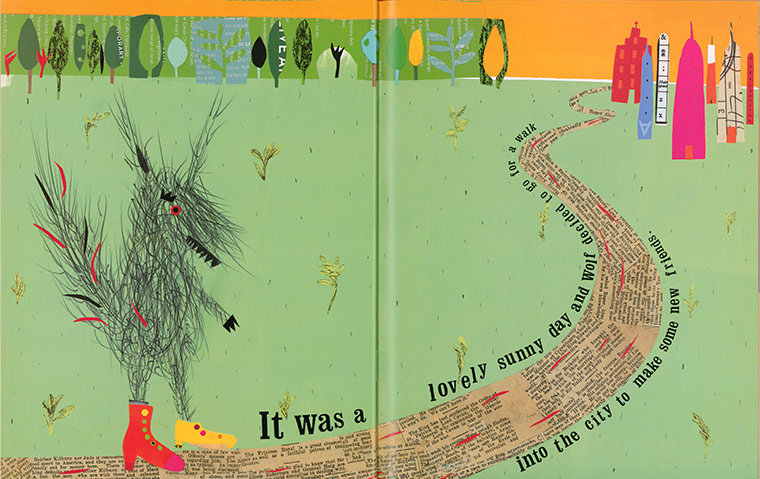
Sara Fanelli - Collage


Bright, engaging, quirky, unusual. Also informative.

Fanelli uses humour to engage children to her work.

The Guardian describes her work as a "breath of fresh air". The medium of collage is not used a lot  - even in children's books, etc. - so I think it is unusual enough to grab their attention.

From The Guardian:
Everything in Fanelli's collages has had a previous life. Sweet papers are crinkled and torn, newsprint is yellowed: every mark, every stain has its own story to tell.
Fanelli's favoured medium is collage, which she has developed in a very personal way. She took it up not just as a way of moving on from the flat colours she'd always used in her paintings, but also to make use of a vast collection of bits and pieces
 

I was inspired by Fanelli's use of collage. I think it adds something extra to her work, an extra story of where the materials could have come from. The stylized, textured visual language is almost child-like and children really love it.


References:
http://www.sarafanelli.com/
http://www.theguardian.com/childrens-books-site/gallery/2011/mar/31/childrens-books-7-and-under

Saturday, 4 January 2014

Whinlatter Forest: The Stick Man Trail

The Stick Man Trail was present in Whinlatter forest from December and up until the end of January. In contrast to the Squirrel Scurry and Tracks Trail, this trail was clearly marked with directional signs and constantly kept the interest of a young audience by having activities along the way. We discovered no one doing the Squirrel Scurry and Tracks Trail, yet we found that many families were doing the Stick Man Trail and there was certainly a reason why this was the preferred one. The "Stick Man" is based on a children's book written by Julia Donaldson and illustrated by Axel Scheffler.

The trail starting off with a clear marker, signalling the start. The Squirrel Scurry and Tracks Trail did not have a clear starting point and I think a sign saying such is beneficial for children.

Constant markers were present to encourage and explain that you were on track. This could have been useful for the other trails and might have avoided us getting lost!

Each sign was very similar, meaning that you were immediately able to spot one. They also contained the character which marked the trail and were bright and colourful enough to stand out amongst the browns and greens of the forest. It was never far that you had to travel before you found a sign which marked this trail.

Information boards were also present and marked activities that children could complete along the way.
 Some were information, others simply to get the children more involved in the trail.
Many families were undertaking this trail, rather than the others:
Colourful illustrations and minimal text on the information boards would appeal to the younger target audience.
And we did see a number of children undertaking these activites. For example there were a number of dens which had already been made, which was encouraged as an activity in the above image. As we passed, a family were also making their own. Making a den is such a fun, simple idea and is obviously going to appeal to children. However, I liked that the parents could also get involved with this activity, as we saw some parents helping the children make a 'den'.
Next, at one point in the trail there were also a number of other signs that were educational and linked to the below information board. There were hidden on various trees and could have made a fun game for the children to find them all, while also learning.
Other fun activites:

Toward the end of the trail, there were also poems to find, presented on trees. Stories from the Twig Man book were present. I think that the poem and the story should have been separated, as they intertwined and this could have caused some confusion. Perhaps the story would have been better suited at the start of the trail.


Last, a sign marked the completion of the trail, which I think would give the child a sense of success and completion.
 When the trail ended, the play park was present, which seemed like a reward for the children.
Overall, I felt that this trail was so much more successful than the two others and this was evidenced in the number of families undertaking it. Wayfinding signs were clear and frequent. Activities kept children engaged for a long time and differentiated so that the young audience would not grow bored. The only thing that I could think to improve upon was that it would be nice to include booklet with this trail, which perhaps showed a map, like the other two trails were given.