Axel Peemoeller
As you make your way through the car park's interior, you are given directions. Long lines of vibrant colours are painted on the walls and floor and when you stand in the correct location you are able to see that they make up a word. Peemoeller makes use of primary colours, for “Down” is shown in a vibrant yellow colour, “Out” in red, “Up” in blue and “In” in green. However, someone pointed out on this blog that it could be questionable whether yellow was a sensible colour choice, saying that if you were to look at the yellow paint in a location where you cannot see how it forms the word “Down” you may mistake the paint for double yellow lines, signalling caution to drive in that direction.
This wayfinding system is so unexpected and creative. I can imagine these signs to be intriguing and fun to view. The large, bold words clearly mark the way in which you should be driving, meaning that it also works successfully as a wayfinding system. Yet there is also an added playfulness.
---
Ralston & Bau
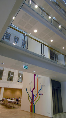
Ralston & Bau is a design studio that designed interesting
wayfinding for the Storehagen Atrium building in Norway in 2011. The
Storehagen Atrium is a 5000 m2 governmental building. The wayfinding
system they designed for this building was heavily inspired by the
underground signage. Strong colours and graphical shapes are
dedicated to each floor and insinuation. They wanted their signs to
be universal, to make the system easy to understand for any user, such as people with visual impairment.
Colours begin in one place, explained at the start with adjoining text and numbers to show which section of the building they represent. Users can then follow their colours to their end destination. This a wayfinding technique that I have seen in buildings, such as the Worcester City Centre Campus and by local doctors. I have always found that they work very successfully.
References:


No comments:
Post a Comment