When I visited London, I took particular interest in the wayfinding system, Legible London.
At
the top of the sign, clashing black and yellow colours have been used
to draw the attention of travellers from a good distance away, those
who are purposely seeking a wayfinding system. When walking around
London, I could immediately spot one of these signs from a good
distance away due to the dramatic splash of yellow and the walking
man symbol, making this technique very effective.
The
font used throughout the sign is New Johnston, while the body text is
12 pt and written in Johnston Light. New Johnston is a redesign of
the original London underground typeface. People are so used to
seeing this font when traveling the underground (as most Londoners
do) that it becomes subconsciously familiar to them, perhaps making
this the perfect font to be located on other way-finding signs. This
is a simple, sans-serif font, used because this style of type is
clearer from a distance and for quick reading. It is more advanced in
these areas than a serif font would be.
Considerations
have also been given to users with physical difficulties. as the map
is positioned at a height easily readable for members of the public
who are in wheelchairs. However, not much consideration has been
given to visually impaired (though white text on a black background
is said to help), as the writing is not overly large and no braille has
been supplied.
This wayfinding system has not been designed for children. I certainly don't think that a child would be able to understand it and, after all, it is expected that the parents will do the navigating.
Museums usually offer fun ways to
engage children and encourage them to take interest in their
surroundings. Otherwise such places could be quite boring for them.
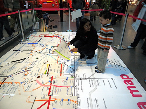
When I visited the London Transport Museum, there were many children
present and all of them were rushing around, excited to be in this
environment.
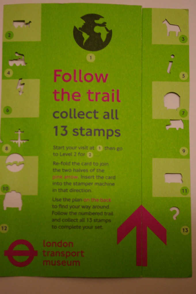
Also, in each different section of
the museum, there was a stand where you could “stamp” your
ticket. The machine punctuated a hole in your ticket, into the shape
of something that usually related to the museum itself. So, for
example, you could collect a bus stamp, train stamp etc. The idea was
to “collect them all”, which also encourages the children to move
around the museum and explore each section.
A card could also been given to you
at the start, which you could use to collect the stamps. It also
briefly explained how to work the stamping machine.
This is a fun, creative way to
interest children all the way through the museum.
Wendy Parker was commissioned to
design the wayfinding system for an 8000 square foot children’s
area at South Mountain Community Church. Taking inspiration from the
church's name, Parker used a theme of “Mountains” throughout the building. With her
directional signs, she mimicked the shape of forestry signage, while
also using a playful wood grain appearance.
Murals of the outside world decorated
the corridor walls, adding colour and nature to what would otherwise
be a boring grey wall. This was a similar technique used in the
hospital wayfinding systems (see previous post). They also reflected
the natural world through their illustrations. I think this creates a
fresh and more exciting atmosphere for the children to enjoy. And,
again, characterisation has been used, though through human
characters in this example.
Including characters in wayfinding
system seems to be a safe way of engaging a younger audience.
For example, Graphic Designer, Greg Crothers,
suggested a wayfinding symbol system, to be used in a children's
activity centre. Characterisation and colour was the main
focus.
I particularly liked how he
incorporated his character into bold, simplistic and easily
recognisable symbols. The outfit and accessories of the character
also reinforce the area in which the wayfinding sign symbolises. From
a first glance, you can identify immediately which area the image
symbolises. The only one I had to think twice about was the yellow
parking sign. But the other signs almost don't need adjoining text to
go along with them.
I researched into two Hospitals -
Great Ormond Street Hospital and The Royal Children's Hospital (RCH)
Melbourne – who redesigned their wayfinding system to better suit
the need of children.
The Royal Children's Hospital (RCH)
Melbourne
Up to 10,000 people visit this
hospital every day and their wayfinding system (which started
development in 2009 and was finalized in 2011) was built specifically
with children in mind. It brings together six levels of clinical,
research and education facilities in a wholly unique way.
During the research stage, the
designers collaborated with child physiologists as well as over 600
children. Staff and patient surveys were also a key method used, as
well as interviews and observation techniques so that they could
better understand adult versus child wayfinding abilities. They also
looked into designing for those with English as a second language.
One of their studies showed that the
use of clinical terminology could be confusing and intimidating for
children. Finn Butler, Wayfinding Direction for Büro
North, explains that they moved “away from clinical terminology to
make it a lot more accessible”. With this in mind, they introduced
friendlier names for different sections of the hospital, linking
these back to the artwork on the walls with names such as “Koala
Ward” and “Possum Ward”.
Indeed, characterisation has been
used to engage children to the hospital's signs. The wayfinding system created
likens the hospital to the natural world. You start at the lower
ground level, marked with the theme of “Underground” and travel
right to the top floor, where the theme is “Sky”. Specific areas
on each level relate to the theme. For example, “Koala Ward”
exists on the “Tree Tops” level.
Further creative decisions are made
throughout the hospital. The lift is symbolized with either an
illustration of a beanstalk or slide, while colourful, quirky
illustrations attract the eye from a distance.
The design company worked with
illustrator Jane Reiseger to produce these illustrations. Reiseger says that
her illustrations are “fairy intuitive”, which can be seen in her
loose lines and a simplicity that is almost child-like. The
illustrations had to also provide a calming distraction, which has
been achieved especially through the use of colour. Colour has been
effectively integrated into the building, taking a step away from
the usual intimidating white walls of a medical location. The colours are bright enough to attract a
child's attention, though they do not go overboard, for each level
has its own colour scheme, which is linked to the name of their
floor. For example, “Underwater” works with mainly blues and
greens.
Overall, the wayfinding system
successfully works in engaging children and making the Royal Children's Hospital a more
calming and less intimidating place.
They also looked at environmental considerations when they built the design, seen in the video below:
Great Ormond Street Hospital
Great Ormond Street Hospital uses a
very similar technique to the Royal Children's Hospital wayfinding
system, developed by Landor Associates. For example, they have also
created the lower floor to have the theme of “under the sea” and
their top floor to have be “sky”. The ward on each floor is also
named after an animal that is associated with the theme of that
floor. These characters can help “guide” the patient or visitor
to different parts of the hospital.
They have also created a colour
identity, to be given to each of the hospital's six buildings, making
navigation through various buildings much less confusing. "For
me, it required a multi-storey car park level of simplicity of
navigation," the design director at Landor Associates, Carl
Halksworth, said, “but we couldn't stop there because when you
understand the nature of the organisation, you don't want to just
apply some big numbers and say that's what it's all about. We wanted
to take the opportunity to really get into the culture of the
hospital."
He goes on to explain, “It was an
eye-opener when we started to talk to the team at GOSH about the way
distraction / distraction therapy – is a key part of the
therapeutic environment. The thinking is, if you’re going to give
someone a big injection in their bottom, give them something to look
at, get them to count the number of bees on the wall – it will make
the situation better. So we wanted to look at how we could bring that
distraction into our scheme and to make it more of an inviting and
welcoming environment.”
Currently, I would like to use my double NegotiatedProduction module to further explore information design, especially wayfinding systems, such as trails. I would like to focus on children's wayfinding systems and how they differ to information graphics designed for adults.
Learning outcomes:
- Research and critically evaluate a range of existing examples of wayfinding systems, analysing what makes them successful or otherwise.
- Generate, and select from a range of paper based ideas, a proposal that
can be developed into a wayfinding system.
- Choose and use a range of design tools.
- Work responsibly with appropriate time-management techniques.
- Design a communication solution using an appropriate medium.
- Make judgments about the appropriateness of different design approaches, regarding what is suitable for children to understand.
Since I have lectures on Tuesday and Thursday, I have decided to make
Wednesday my day for focusing on my Independent Study and Friday the day
for my Negotiated Production module. I should be doing about seven
hours a week on both of these modules and plan to put in the majority of
these hours on the set days. However, I can also use the weekend or
Monday to add in extra hours, if needed.