Showing posts with label buildings. Show all posts

Tuesday, 17 December 2013

Children's Library Identity

Hvass & Hannibal designed a visual indentiy for the children's department at Copenhagen's central library, Hovedbiblioteket in October 2013.

It explains on Nan Na Hvass and Sofie Hannibal's website: "The identity is based on a modular system of shapes that can form different characters and patterns. The idea is that the kids can have fun with this system – creating stories and characters of their own – and that the identity can continue to grow in many directions."

Logo:
The different patterns and shaped can be mixed and matched, which encourages children to get involved with the design. The children can interact, making their own stories and designs. These objects are very simplistic; obvious shapes and block colouring. This is what makes them work so well with the child target audience.
Hvass and Hannibal did user testing with the pupils from the school Skolen på Islands Brygges. They left the children with the cut-out shapes, saying to them that they could experiment and stick the shapes on the windows of the library's building. They also asked ten to twelve year old students to rate a series of logo designs.

The results showed that, though the librarians preferred the more complex designs, the children enjoyed the more simplistic ones, which reflected in Hvass and Hannibal final designs. They also kept the logo very simple. After seeing the success of their designs, the designers plan to form a sticker sheet so that the children can put them on their notebooks or backpacks. They also want to create canvas bags and t-shirts with their designs.


In my opinion, the interactive element is very strong, as children like to be involved with things. It will certainly keep their attention for a longer period of time and let them have fun with the design.


References:
http://www.creativereview.co.uk/cr-blog/2013/october/hvass-and-hannibal-6527965279hovedbiblioteket
http://hvasshannibal.dk/bib.html

Kasia Kaczmarek: Children's Hospital Wayfinding System

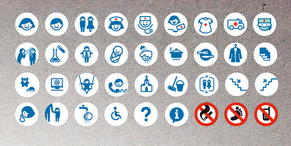
Kasia Kaczmarek developed a concept for wayfinding in a children's' hospitals. The graphical images she has produced sum up what I have learned about designing wayfinding for children. For she includes bright colours and playful characters. Her pictograms are simplistic and easily understandable and adopt a cartoon-like visual language. Pictograms also rarely use more than two colours. This one uses a blue as the main colour and adds other colours in only when needed. For example, red is used on a cross to easily identify the appearance of medical staff and a bold red crosses the things that you cannot do.


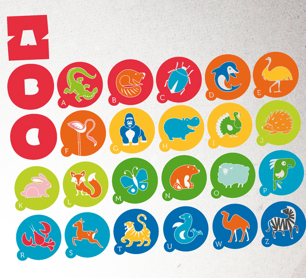
Th characters below are easily recongisable by their obvious shape and appearance, yet the colour and slightly exaggerated shapes lend a strong illustrative appearance that makes them unique and interesting. Curves have been used in the making of these animal, softening their appearance to something child-friendly.
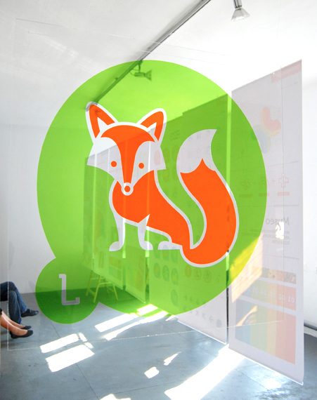
Characters often mark different locations:


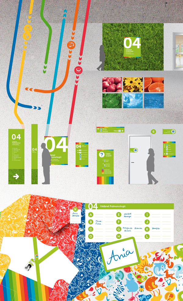
Colours are also used to help children differentiate between locations; they know to follow the orange trail to reach a certain destination, for example. Nature is also brought into the designs, with animals but also with grass and flowers. The coloured trails are marked by photographs of natural things which represent that certain colour. Such as yellow flowers represent the yellow path and oranges represent the orange path. I have noticed that a lot of buildings incorporate the outside world into their designs to further engage children and to make the building seem more relaxed and familiar to them.


References:
http://www.behance.net/gallery/The-Children-Hospital-Wayfinding-System/151615
http://www.punktk.com/
http://www.kash-k.blogspot.co.uk/

Michael Faraday School


Cartlidge Levene worked with Michael Faraday School to produce a new wayfinding system for the building. The school is located in Southwark, London. It is in an urban setting, whose demographic rating puts it among the lowest categories in terms of deprivation and ‘inner city adversity’.

Cartlidge Levene was given the brief to develop a wayfinding system that would engage children and make the children, staff and parents feel a pride in their school. Playful, colourful designs have therefore been adopted to create a fun, relaxed space for children and adults to enjoy. The new visual language is so much different than in any school that I have seen and I know I would have enjoyed it at a younger age. The new graphic identity is new and inviting, yet also works well alongside the Faraday logo that can be seen above the main entrance.


The layout includes a continuous row of year group classrooms, which form around a circular space that stretches two levels. Flag signs of different colours fold outward to display the identity of each of these year groups. There is also a "flexible learning space", which has been named the Living Room, positioned in the centre of the school. Classrooms for year groups one to six are arranged around it. The Living Room is made up of a bright yellow wall, which looks wholly unique and interesting and gives the children a relaxed space to unwind in.

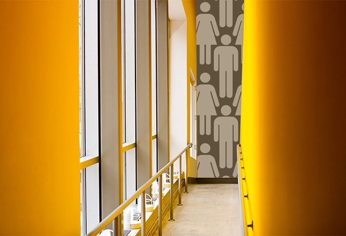
A paperchain of male and female toilet logos are clearly displayed across a wall to mark the presence of the toilets. This brought me back to my previous blog post, where a similar technique is used, only with wallpaper patterns.


Concept art:


References:
http://www.creativereview.co.uk/cr-blog/2011/june/cartlidge-levene-michael-faraday-school-signage

Paz-Holandesa Hospital: Children's Medical Centre

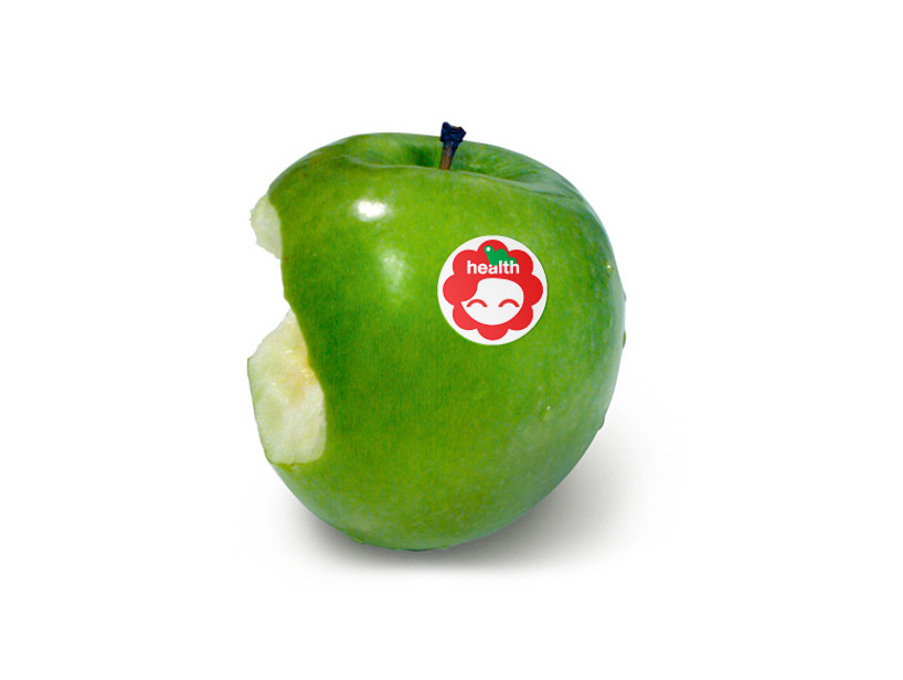
Paz-Holandesa is based in Peru. Its service is based on equality; social or economic conditions play no role. The strong graphic identity that the hospital has adopted immediately caught my attention as successful wayfinding for children. 
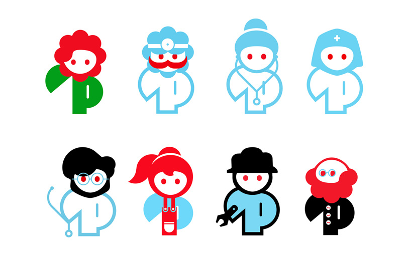
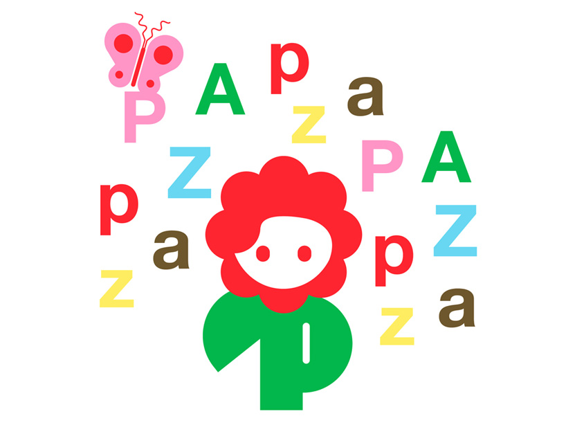
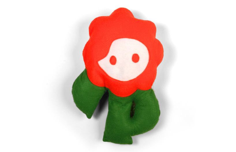
Rejane Dal Bello, the designer, says, "The character needed to evoke hope and strength so I chose bold, solid characters and vibrant colors for their power and energy and the flower as a metaphor of growth. This all added up to to be the elements that define the visual identity."

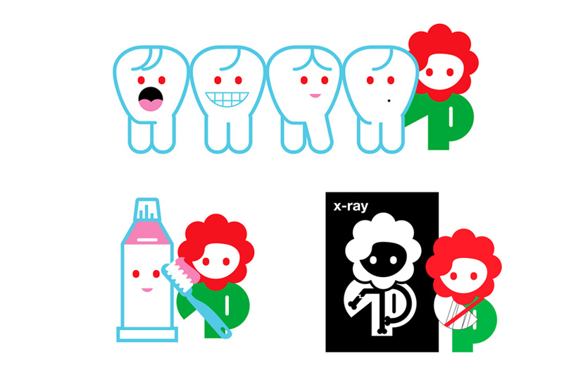
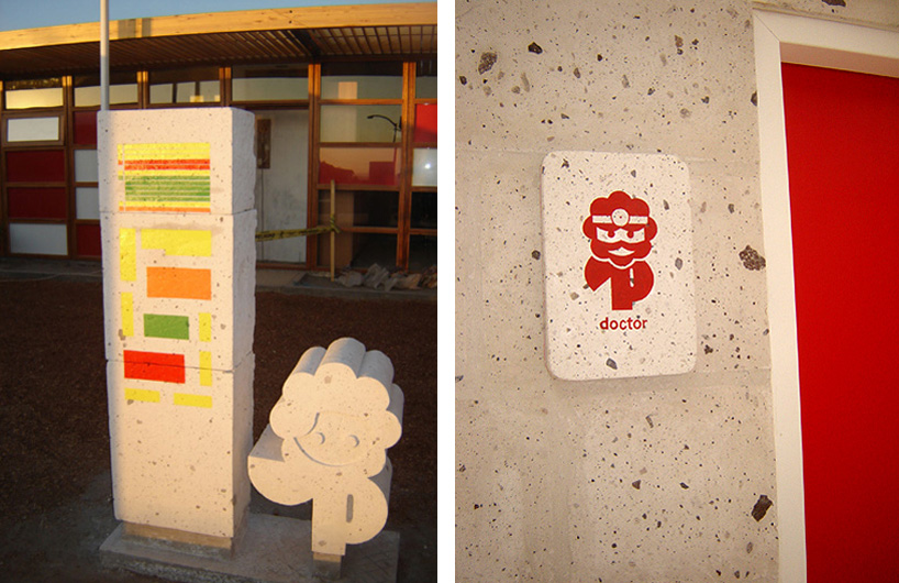
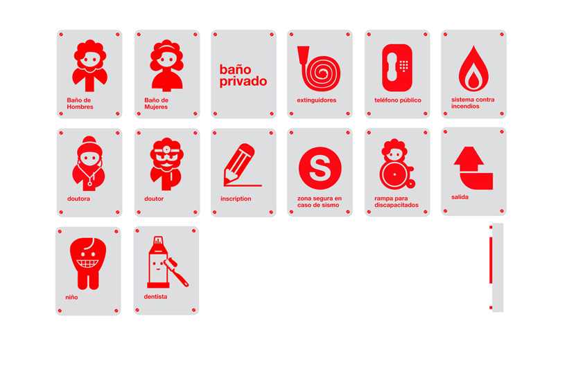
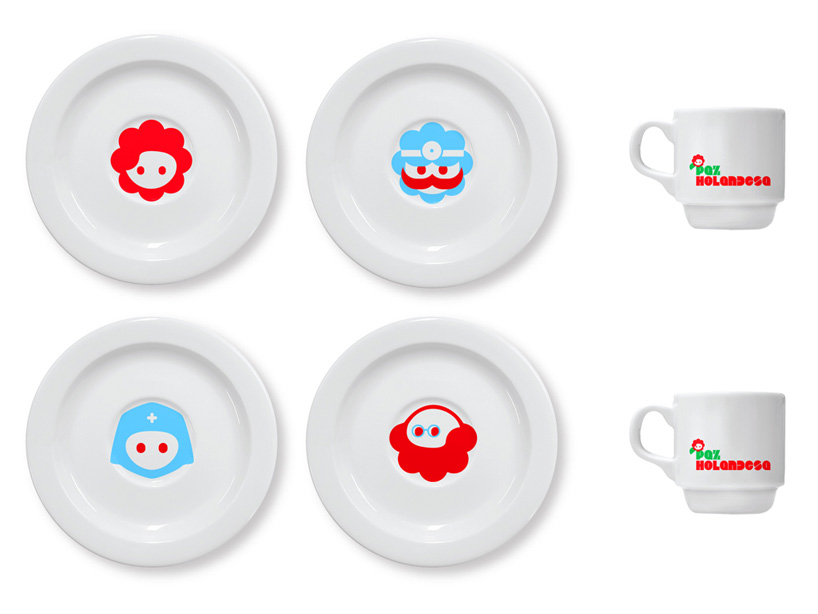
The characters all keep to a consistent visual language. Their design has been influenced by the main flower logo and they keep to this shape. However, their faces and accessories differ so that the children can tell each one apart and understand what symbolizes a nurse, a doctor etc. The playful design and bright colour is less intimidating for a child, which goes a long way to comfort them in such an environment. 

The designer also said of the other characters: "The other characters represent the staff of the hospital which help PAZ. They're meant to be part of the daily life in the hospital, so the characters are based on real staff members as the doctors, doctor's assistants, nurses, administrator, cleaner, technician etc.
so the character can interact with the patients." 

The characters are based on real people, so perhaps this would make it much more understandable for children. To make this even more simplistic, the staff do not wear traditional uniform, but instead wear a t-shirt with their character printed on it. This means that a doctor's clothing is the same as a administrators or cleaners, only differentiated by the printed character. This also lends a family feel to the Hospital, which will put children at more ease.

Rejane Dal Bello said: "It's funny because the director, Marjan van Mourik, told me that the doctors hated this idea because they want to use their traditional, hierarchical doctors clothing… New ideas tend to upset people!"

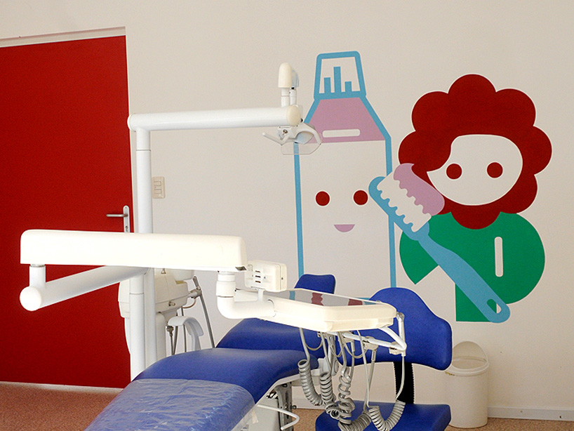
 Wall paintings


Building signage

Wall decor

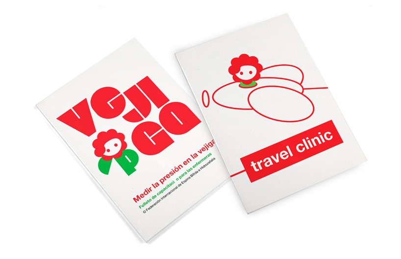
Pamphlet
 
 
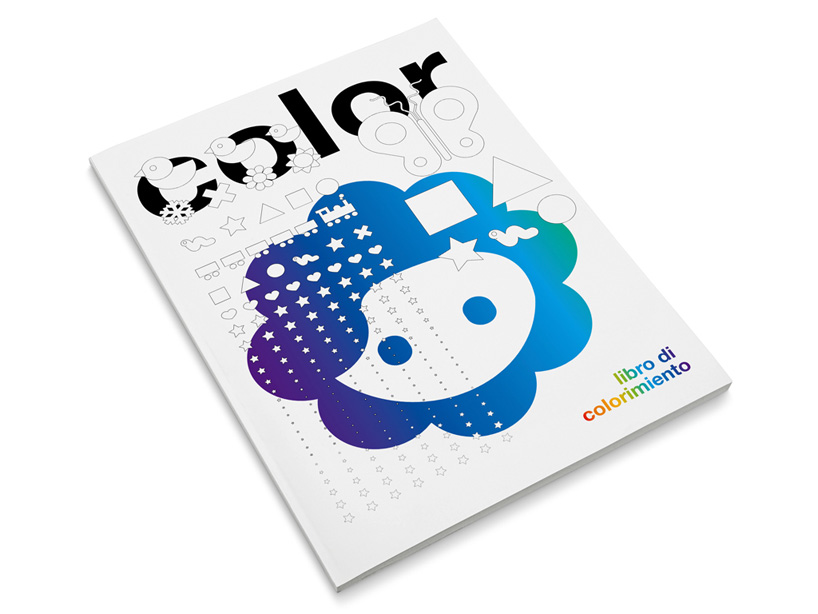
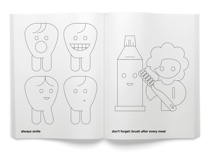
Colouring book


Tableware

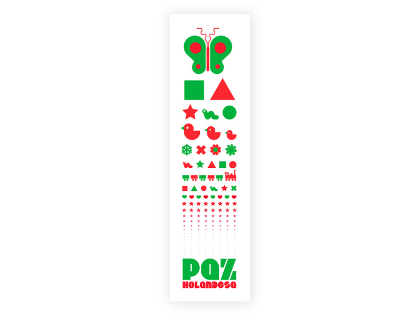
Eye chart test. Shapes used instead of letters.


 A strong, consistent theme has been kept throughout.


References:
http://rejanedalbello.com/

Saturday, 16 November 2013

Mike & Maaike: Wallpaper Wayfinding

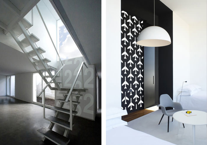
Mike & Maaike is a industrial design studio led by Mike Simonian and Maaike Evers. Together they designed a series of wallpapers that worked as a wayfinding system.
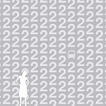
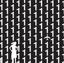
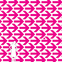
Wallpaper is typically decorative, while symbols/pictograms are typically functional... by combining the two you are given a working wayfinding system that is also very aesthetically pleasing and easily compliments the surrounding space.
I think that the wallpaper may stand out more prominently than regular signs, for it is taking up much more space. You would be able to see the wallpaper symbols from a great distance, perhaps even if you have poor eyesight, and therefore you would be able to find your destination with more speed.
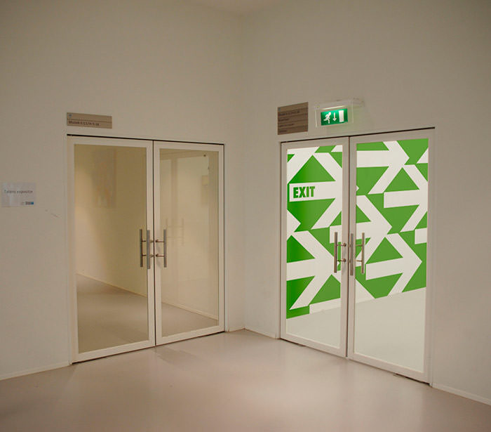
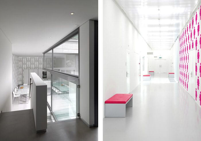
The symbols that appear on the wallpaper are traditional, universal pictograms that clearly represent what they are explaining. For example, the typical male and female symbol has been put in use to show the direction of the toilets, while arrows have been used to show the way to the exit and a knife and fork leads the way to a cafe. Typical colour has also been used, with a bright pink to show where the female toilets are located and green arrows to show the direction of fire exits. Most of these colours are also very vibrant, so that they can be easily spotted.
The wallpaper does not exactly point you in the direction of your needed destination (apart from the arrow wallpaper that shows exits), though it seems to mark the end destination. The wallpaper seems to be set up to lead you to the area. For example, at the end of corridor you are able to see the male and female symbols for the toilet. By walking toward the wallpaper, you are then able to look around the corner, where you can see different wallpaper, showing the pink female symbol for the women's toilet or the blue male symbol. These symbols are shown just outside of the toilet doors.
Perhaps signs would need to be put in place at the entrance of the building, to lead people in the right direction of different locations and then, once you are drawing closer to that destination, the wallpaper wayfinding system can be put in use.

What is also great about this design is that it could be understood by both adults and children. However, more advanced symbols may be confusing to children.


References: 
http://www.mikeandmaaike.com
http://www.mikeandmaaike.com/#p_wayfinder-wallpaper
http://www.mikeandmaaike.com/press/WAYFINDER%20WALLPAPER
http://ccd-design.blogspot.co.uk/2010/11/wayfinding-is-more-than-signage-using.html