Paz-Holandesa is based in Peru. Its service is based on
equality; social or economic conditions play no role. The strong graphic identity that the hospital has adopted immediately caught my attention as successful wayfinding for children.
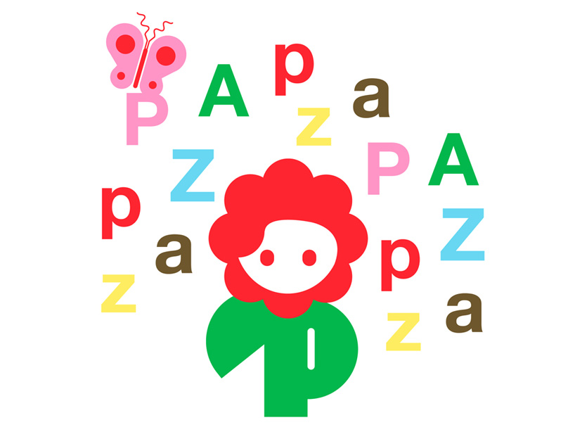
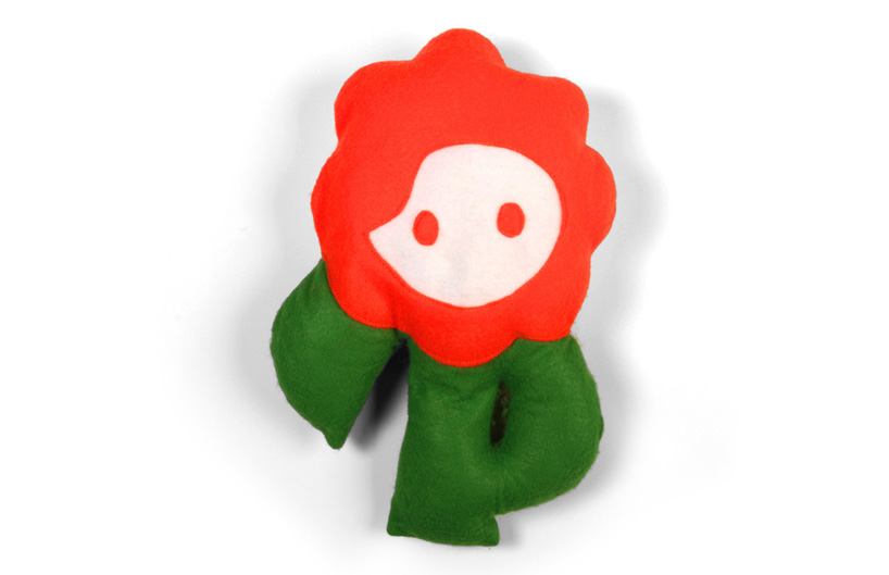
Rejane Dal Bello, the designer, says, "The character needed to evoke hope and strength so I chose bold, solid characters and vibrant colors for their power and energy and the flower as a metaphor of growth. This all added up to to be the elements that define the visual identity."
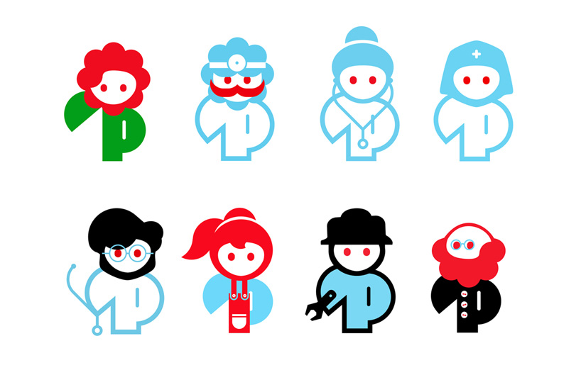
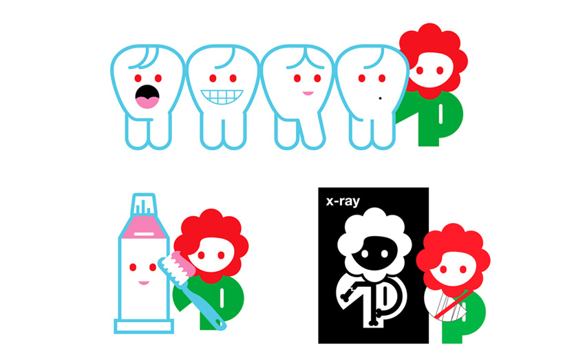
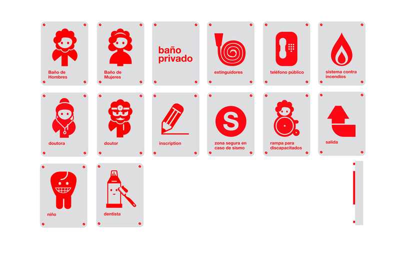
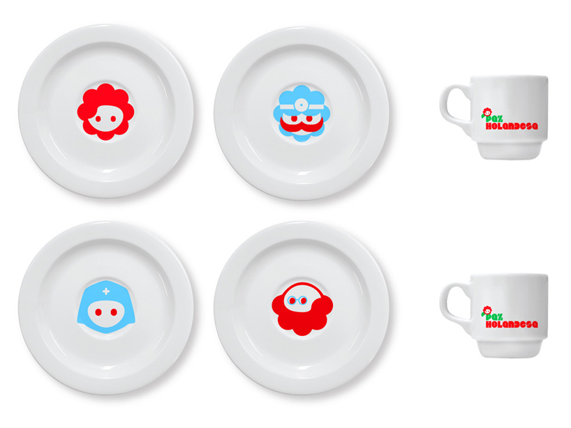
The characters all keep to a consistent visual language. Their design has been influenced by the main flower logo and they keep to this shape. However, their faces and accessories differ so that the children can tell each one apart and understand what symbolizes a nurse, a doctor etc. The playful design and bright colour is less intimidating for a child, which goes a long way to comfort them in such an environment.
The designer also said of the other characters: "The other characters represent the staff of the hospital which help PAZ. They're meant to be part of the daily life in the hospital, so the characters are based on real staff members as the doctors, doctor's assistants, nurses, administrator, cleaner, technician etc.
so the character can interact with the patients."
so the character can interact with the patients."
The characters are based on real people, so perhaps this would make it much more understandable for children. To make this even more simplistic, the staff do not wear traditional uniform, but instead wear a t-shirt with their character printed on it. This means that a doctor's clothing is the same as a administrators or cleaners, only differentiated by the printed character. This also lends a family feel to the Hospital, which will put children at more ease.
Rejane Dal Bello said: "It's funny because the director, Marjan van Mourik, told me that the doctors hated this idea because they want to use their traditional, hierarchical doctors clothing… New ideas tend to upset people!"
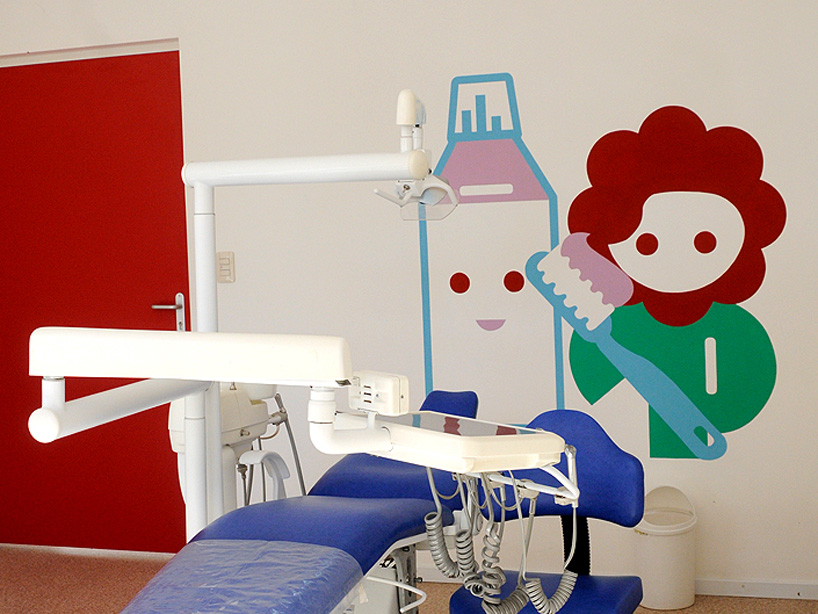
Wall paintings
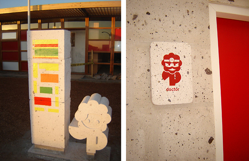
Building signage
Wall decor
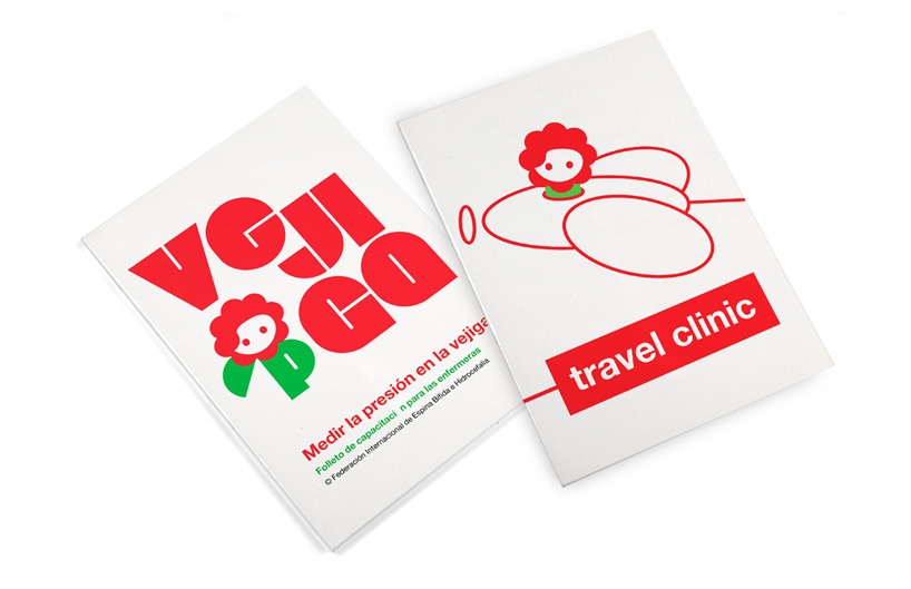
Pamphlet
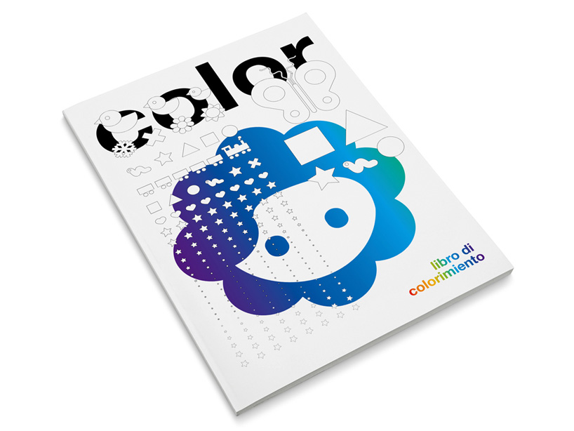
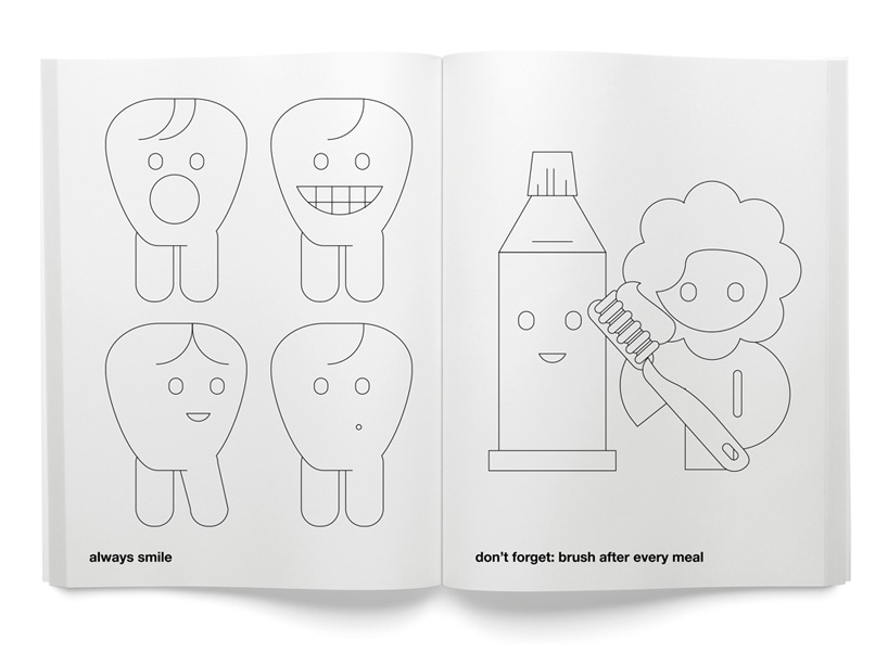
Colouring book
Tableware
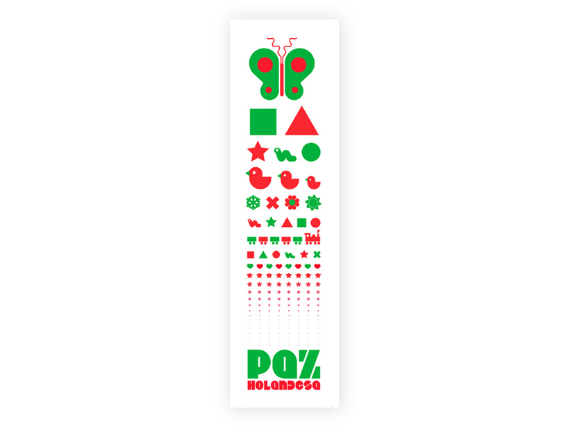
Eye chart test. Shapes used instead of letters.
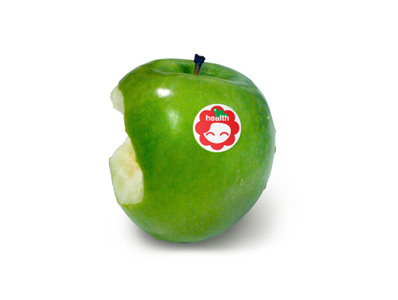
A strong, consistent theme has been kept throughout.
References:
http://rejanedalbello.com/

No comments:
Post a Comment