
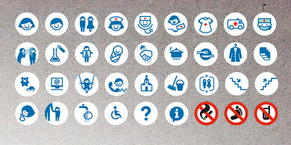
Kasia Kaczmarek developed a concept for wayfinding in a children's' hospitals. The graphical images she has produced sum up what I have learned about designing wayfinding for children. For she includes bright colours and playful characters. Her pictograms are simplistic and easily understandable and adopt a cartoon-like visual language. Pictograms also rarely use more than two colours. This one uses a blue as the main colour and adds other colours in only when needed. For example, red is used on a cross to easily identify the appearance of medical staff and a bold red crosses the things that you cannot do.
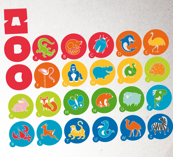

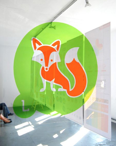
Characters often mark different locations:

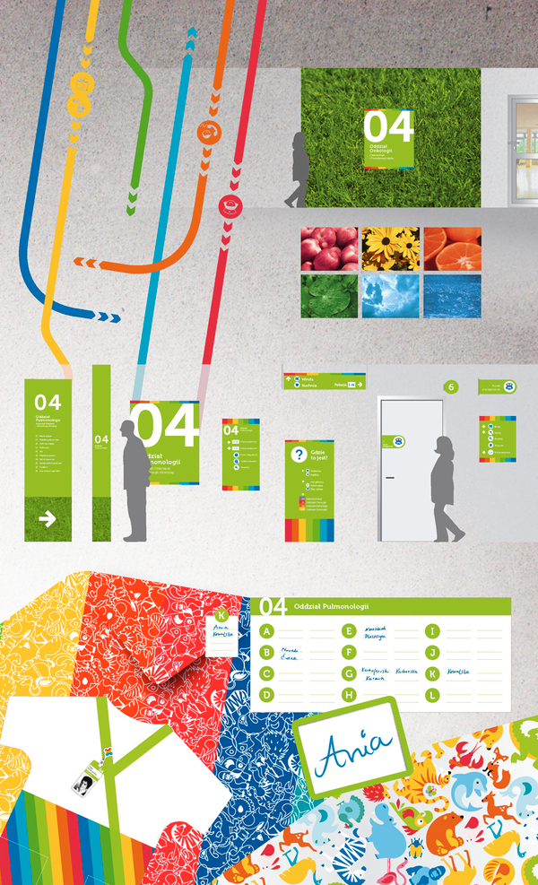
Colours are also used to help children differentiate between locations; they know to follow the orange trail to reach a certain destination, for example. Nature is also brought into the designs, with animals but also with grass and flowers. The coloured trails are marked by photographs of natural things which represent that certain colour. Such as yellow flowers represent the yellow path and oranges represent the orange path. I have noticed that a lot of buildings incorporate the outside world into their designs to further engage children and to make the building seem more relaxed and familiar to them.

References:
http://www.behance.net/gallery/The-Children-Hospital-Wayfinding-System/151615
http://www.punktk.com/
http://www.kash-k.blogspot.co.uk/
No comments:
Post a Comment