Washington, DC Zoo
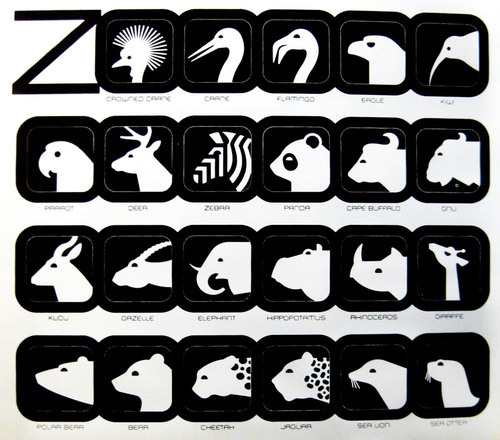
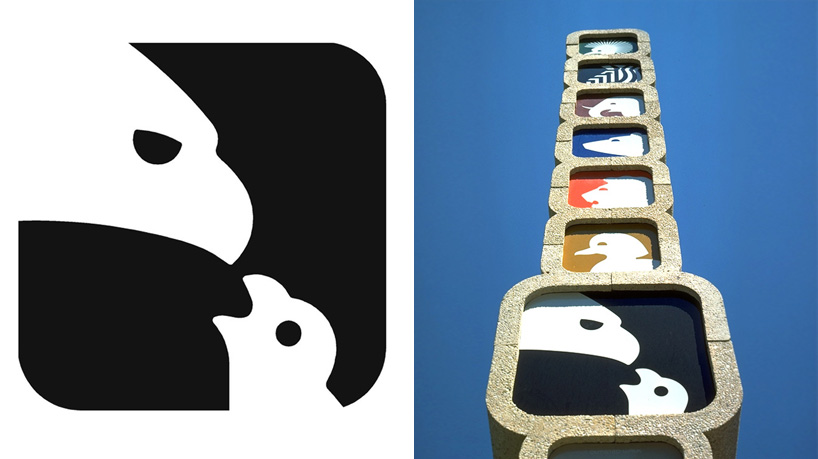
In 1973, Lance Wyman created a number of icons for the National Zoological Park in Washington, DC as part of its comprehensive branding and wayfinding system. He explains on his website that his designs of, “Totem” structures containing colour coded animal icons identify the trails and exhibit areas of the National Zoo.”
In 1973, Lance Wyman created a number of icons for the National Zoological Park in Washington, DC as part of its comprehensive branding and wayfinding system. He explains on his website that his designs of, “Totem” structures containing colour coded animal icons identify the trails and exhibit areas of the National Zoo.”


His
icons appear simplistic, large and bold, using flat colours and
understandable shapes so that they immediately stand out to
passersby. This is an example of when detail should be minimal; Wyman
used the most simplistic shapes so that the animals were easily
identifiable. By adding any more detail, the icons would become overly
complex and would not hold the same bold appearance; instead people
could overlook them. Each of the 36 animal icons are shown from a side view, as many animals (such as the elephant and rhino) are more easily recognised from their side view. Other animals (such as the zebra, tiger and cheetah) have been given graphical patterns such as stripes or spots so that they are more easily identifiable.

For
the animal's identity on these icons, Wyman has used shapes that are
clear and boarding stereotypical in their designs. This is so that
people can identify the animal on the sign without having to read the
text. If the animals were more experimental and not quite so typical
in appearance, people would not be able to understand what the signs
showed and therefore would not be able to read them at first glance. He said in an interview, (seen here: http://www.designboom.com/design/lance-wyman-interview) "Don't
overlook the obvious. Designers too often neglect exploring ideas
because they seem too obvious, trite, corny, etc. when the obvious is
transformed into a new image it can be powerful and easily understood."
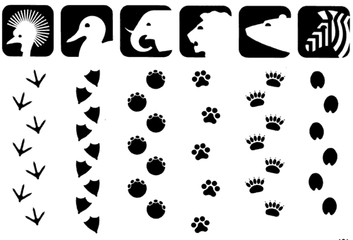
Wyman also created pawprints on the ground (built from the same visual language as the identifying icons) that lead the visitor through the zoo’s layout to the corresponding animal. He explains, “Animal tracks on maps are applied directly to the pathways to help visitors find their way with a minimum of signs.”
Wyman also created pawprints on the ground (built from the same visual language as the identifying icons) that lead the visitor through the zoo’s layout to the corresponding animal. He explains, “Animal tracks on maps are applied directly to the pathways to help visitors find their way with a minimum of signs.”


Logo

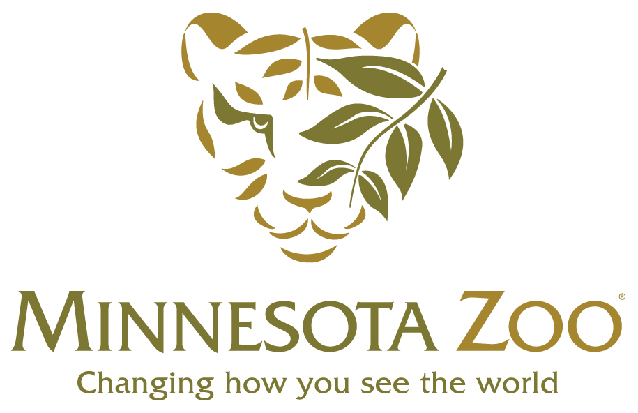
Minnesota Zoo
Created
in 1984, the Minnesota Zoo logo combines the letter “M” with a
Minnesota Moose, an important state animal. The logo sets the tone
for the rest of the zoo's visual language.


For
this zoo, Wyman identifies the five major zoo trails with numerals.
Each of these numbers is combined with the image of an animal
resident of that trail.
1
Ocean Trail -> Whale
2.
Tropics Trail -> Tropical Bird
3.
Minnesota Trail -> Beaver
4.
Discovery Trail -> Monkey
5
Northern Trail -> Camel


A
combination of an arrow and a bird in flight, labelled the “guide
bird”, directs people and traffic around the zoo. (Seen bottom right below.)

The
colour scheme, meanwhile, is minimal and monochrome: black and white
is used against a charcoal background. All signs are therefore clear,
bold and easily legible.


Wyman's brainstorming of designs:


Ending Thoughts:
- I think that the designs for these two zoos are suitable for both adults and children. Children would also be able to understand them due to their bold and simplistic apperance, as well as the introduction of characters and (regarding the Washington zoo anyway) colour.
- I think that it is okay to go with the obvious somtimes. I have been taught in my illustration classes to never get too close to something so typical, but, in information design, things need to be clear and, as Wyman said, "When the obvious is transformed into a new image it can be powerful and easily understood."
- Bold and simple works.
- Idea generation is key to gaining a good design (see Wyman's brainstorming of ideas above).
References:
http://www.lancewyman.com/
No comments:
Post a Comment